Use design to evoke calm and credibility in wellness spaces


As a female entrepreneur in the wellness space, your brand isn’t just a logo or a color scheme—it’s an experience. It’s the energy your clients feel when they visit your website, walk into your studio, or interact with your content. Creating a calm and trustworthy brand through design is essential to connect deeply with your audience and build lasting client relationships.

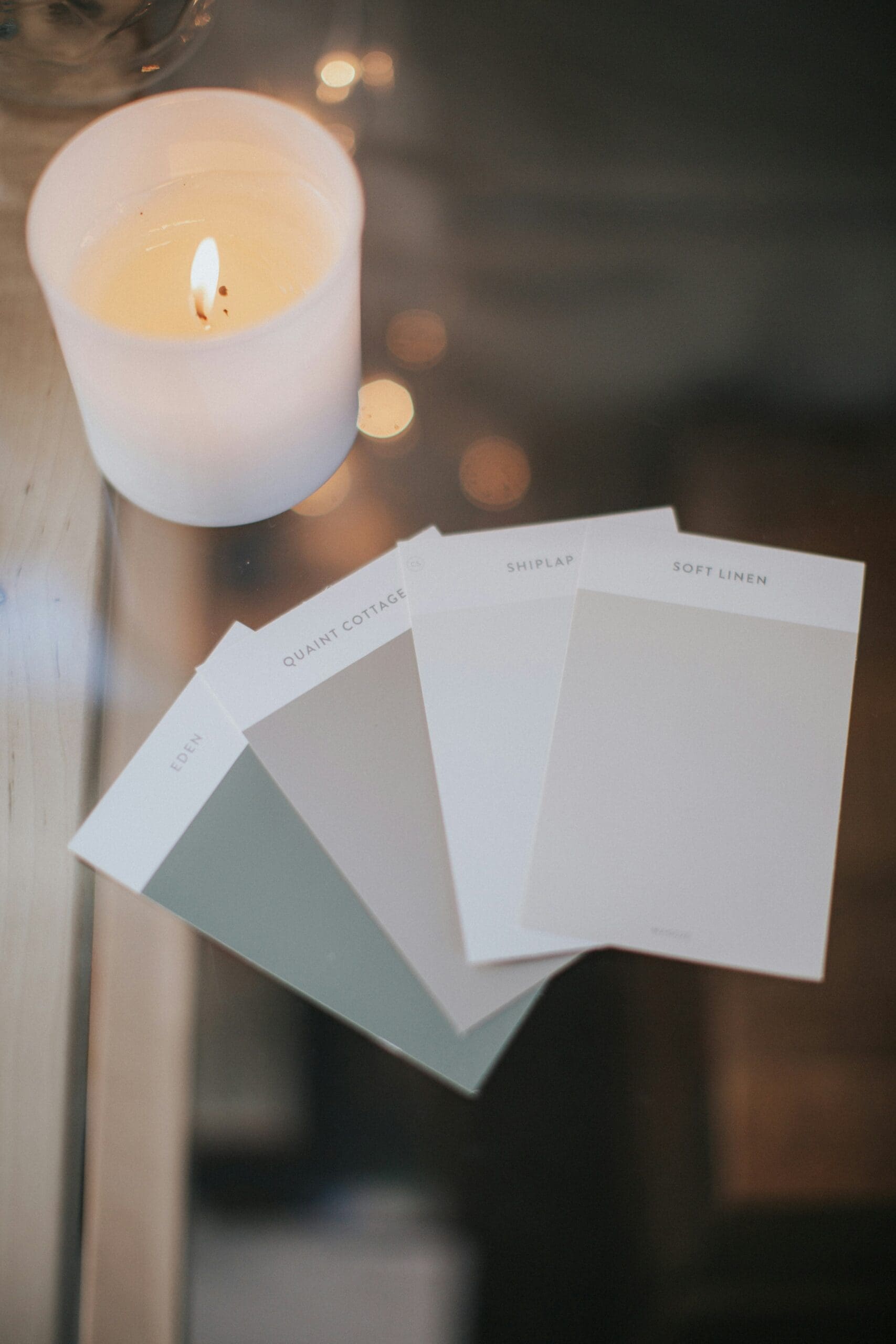
One powerful way to achieve this is by leveraging color psychology for websites—but not just any colors. The best brands reflect the founder’s own personal color analysis, converting their unique palette into a cohesive brand persona that exudes authenticity, calm, and credibility.

Let’s explore how your website color palette can be a strategic tool to build trust and create a serene, welcoming atmosphere that mirrors who you are as a business owner.


Why Personal Color Analysis Matters in Brand Design

Think of your personal color palette as your own style fingerprint. When your brand colors harmonize with your natural tones—skin, hair, eyes—they create an authentic visual language that conveys confidence and clarity.

  • Authenticity breeds trust: Clients sense when your brand feels genuine. Aligning your color palette with your personal season or palette not only boosts your confidence but also reassures clients that your brand is true and consistent.
  • Confidence is magnetic: When you show up visually as your authentic self, your energy translates through every pixel and palette choice, attracting clients who resonate with your vibe.
  • Aesthetic cohesion: Matching your personal colors to your brand ensures every piece—website, marketing materials, packaging—works in harmony, reinforcing your brand story.

Choosing Colors That Evoke Calm and Credibility

Wellness clients seek refuge—a space to unwind, heal, and feel supported. Your brand colors should mirror that sanctuary.

  • Soft blues and greens: These hues are proven to calm nerves and evoke balance, making visitors feel safe and cared for.
  • Neutral tones: Warm beiges, soft taupes, and gentle grays create an elegant, timeless backdrop that lets your services and personality shine without distraction.
  • Accent colors: Use your personal palette to select subtle accent colors that inject warmth and character—perhaps a muted coral or lavender that complements your natural tones.

Together, these choices build a website color palette that feels both professional and deeply inviting.


Using Color Psychology to Guide Visitor Emotions

Colors aren’t just pretty—they trigger emotions and behaviors.

  • Blue: Trust, reliability, calm
  • Green: Growth, healing, renewal
  • Beige/Gray: Stability, neutrality, sophistication
  • Soft Pinks/Lavenders: Compassion, creativity, warmth

By intentionally choosing colors that align with these feelings, your website becomes a visual hug—welcoming potential clients and easing their decision to connect with you.


Design Tips to Amplify Calm and Trust

  • Whitespace is your friend: Let your brand colors breathe by using generous whitespace, creating an uncluttered, serene experience.
  • Consistent color usage: Apply your palette consistently across buttons, headlines, and backgrounds to create a professional and polished look.
  • Typography matters: Pair your colors with clean, approachable fonts to maintain readability and sophistication.
  • Imagery with intention: Use photos and graphics that reflect your color story—natural elements, soft lighting, and authentic moments.

Bringing It All Together

When your brand colors resonate with your personal palette and evoke calm and trust, your wellness business stands out as a beacon of authenticity and professionalism.

Your website isn’t just a place to share services—it’s a reflection of your unique presence and the safe space you create for your clients. By using color psychology for websites and crafting a brand color palette inspired by your own natural tones, you’ll build a brand persona that feels both elegant and approachable.


Ready to discover your personal color palette and translate it into a calming, credible brand? Let’s create a website design that not only looks beautiful but truly embodies your essence and empowers your business to flourish.


Would you like a personalized color analysis session to uncover your brand’s perfect palette? Reach out and let’s elevate your visual story together.

Comments +

Leave a Reply

Your email address will not be published. Required fields are marked *

A vibrant red fabric element, perfect for adding a touch of color and visual appeal to your website or marketing materials. Explore the impactful use of color in aesthetic design. #redaesthetic #visualmarketing #brandcolors

Imagine opening your closet and seeing a curated collection of pieces that not only flatter you but also communicate your personal brand with confidence and clarity. For women founders, mastering your seasonal color palette isn’t just about looking good—it’s about extending your credibility and creating a consistent, authentic image that carries through your business, life, and online presence.

Shopping smarter by sticking to your palette is a powerful way to save time, reduce decision fatigue, and invest in pieces that truly serve your style and brand goals. Here’s how to harness your personal color analysis to elevate your wardrobe—and your personal brand.


Why Shopping by Your Color Season Matters for Women Founders

As a woman entrepreneur, your personal brand is your visual handshake—it’s the first impression clients and partners have of you, whether on video calls, at meetings, or in-person events. When your wardrobe aligns with your color season, you radiate confidence, professionalism, and authenticity.

Shopping with your palette in mind means fewer regrets, fewer impulse buys, and a wardrobe that mixes and matches effortlessly. This approach isn’t just stylish; it’s strategic, helping you present your best self with every outfit.


Step 1: Know Your Palette Inside and Out

Before you hit the stores or scroll through online shops, have your color swatches handy. Whether you’re a rich Autumn, a cool Winter, a soft Summer, or a bright Spring, knowing your signature shades allows you to quickly spot pieces that will enhance your natural tones.

Consider printing your palette or saving it on your phone for quick reference—this simple tool helps you avoid distractions and focus on colors that work for you.


Step 2: Build Your Capsule Wardrobe Foundation

Start with neutral staples in your palette—think blazers, trousers, and tops that form the backbone of your professional look. When these foundational pieces complement your skin tone and personal brand, you’ll feel polished and put-together every day.

Adding in a few statement pieces or accessories in your accent colors can then elevate your look without overwhelming your style.


Step 3: Use Color Swatches for Smart Shopping

Whether you’re shopping in-store or online, keep your color swatches for shopping close by. Many brands offer swatch cards or fabric samples—don’t hesitate to request these. If shopping online, zoom in on product photos and compare the hues with your palette.

By trusting your palette, you avoid buying trendy colors that don’t serve you, saving money and preventing clutter.


Step 4: Mix, Match, and Extend Your Brand Identity

When your wardrobe stays true to your palette, mixing and matching becomes second nature. This means you’ll always have outfits ready for client meetings, networking events, or content creation—without the stress of “what to wear.”

This cohesion not only simplifies your daily routine but reinforces your personal brand colors—making you instantly recognizable and memorable.


Step 5: Trust the Process and Allow Flexibility

While your palette is your guide, style is personal. If you find a piece slightly outside your season that you love, learn how to gently “break the rules” by pairing it with colors and textures that keep your overall look cohesive.

Your color palette isn’t a limitation—it’s a tool that empowers you to make choices with intention and confidence.


Final Thoughts: Shop With Purpose, Build With Power

For women founders, shopping by your color season is an investment in your personal brand’s credibility and style longevity. When your wardrobe reflects your best colors, you don’t just look good—you project a powerful, authentic image that resonates in business and life.

Ready to shop smarter and elevate your brand through color? Start by discovering your season, gathering your swatches, and committing to a wardrobe that truly supports the confident, visionary woman you are.


Would you love personalized help with your color palette and building a wardrobe that enhances your personal brand? Let’s create a style strategy that’s as unique and empowered as you are.

A stylish accessory – gold earrings with a red accent – that contributes to a strong overall aesthetic. Consider how impactful visuals like this can enhance website design. #websitevisuals #aestheticdesign #jewelryinspiration

When it comes to building a personal brand that commands attention and respect, color is your secret weapon. For women founders and style-conscious individuals, understanding your seasonal color palette isn’t just a style exercise—it’s a powerful way to enhance your presence, boost confidence, and extend credibility across your business and personal life.

To help you visualize the magic of seasonal color analysis, we’re spotlighting well-known celebrities who embody each of the 12 seasons beautifully. These examples show how aligning with your best hues creates an effortless, authentic glow—exactly what every woman entrepreneur needs to cultivate a magnetic personal brand.


Why Celebrity Color Analysis Matters for Women Founders

Think about the iconic looks you admire on screen or in magazines. Celebrities who wear colors that complement their natural features always stand out. This isn’t by chance—stylists use color analysis to craft those signature looks that feel timeless and true to each personality.

As a woman founder, applying this insight elevates your visual brand, making you appear more polished, confident, and trustworthy. When your colors match your natural tones, you project authenticity—a cornerstone of meaningful client relationships and lasting business success.


Meet the Seasons Through Celebrities

1. Winter – Cool, Bold, and High Contrast

Celebrity Examples: Lucy Liu, Sandra Bullock, Anne Hathaway
Winter palettes thrive on clear, icy hues and jewel tones. Think crisp blacks, deep navy, vibrant reds, and pure whites. Winter personalities exude strength and sophistication, perfect for founders who want to command attention with authority and elegance.

2. Summer – Soft, Cool, and Muted

Celebrity Examples: Taylor Swift, Cate Blanchett, Emma Stone
Summers glow in dusty pastels, soft blues, muted pinks, and lavender. This palette feels gentle yet refined—ideal for women leaders who want to project calm confidence and approachable professionalism.

3. Autumn – Warm, Rich, and Earthy

Celebrity Examples: Emma Watson, Julia Roberts, Jennifer Lopez
Autumn hues are all about warmth—think burnt oranges, olive greens, mustard yellows, and deep browns. These colors evoke grounded strength and creativity, making them perfect for entrepreneurs who want their personal brand to feel warm, inviting, and authentic.

4. Spring – Bright, Warm, and Fresh

Celebrity Examples: Reese Witherspoon, Beyoncé, Kate Hudson
Springs shine in clear, bright colors like coral, turquoise, peach, and warm greens. This palette bursts with energy and optimism, reflecting leaders who inspire and uplift with vibrant personal brands.


How to Use These Examples to Build Your Personal Brand

Seeing celebrities embody their color seasons can help you:

  • Identify your best shades to bring out your natural beauty and confidence.
  • Create a signature look that aligns with your business values and personality.
  • Make wardrobe and branding choices that feel cohesive, authentic, and memorable.

When you wear your perfect colors, you don’t just look good—you communicate trustworthiness and professionalism. This alignment extends to your business branding, creating a seamless personal-to-professional image that clients can connect with instantly.


Final Thoughts: Your Color Season as a Credibility Booster

Incorporating color analysis into your personal branding strategy is an elegant and effective way to enhance your presence. Like the celebrities who perfectly wear their palettes, you can leverage your best colors to boost your confidence and credibility as a founder.

Ready to discover your season and start building your brand with intention? Embrace the power of color—it’s more than aesthetics; it’s your personal brand’s most authentic glow.


Would you like help identifying your color season and creating a personal brand palette that radiates confidence and credibility? Let’s chat!

The moment of choosing an outfit from a visually appealing and well-organized clothing rack. This image highlights a mindful approach to personal style. #outfitinspiration #aestheticwardrobe #personalstyle

When building a powerful personal brand, especially as a woman founder, every detail counts — including the colors you wear. Your seasonal color analysis isn’t just about embracing your best shades; it’s also about recognizing which colors can unintentionally undermine your natural radiance and, ultimately, the credibility you project.

Wearing unflattering colors can wash you out, create a tired or dull appearance, and distract from the confident, authentic brand you want to present. Understanding what not to wear is just as important as knowing your signature palette — it’s a personal enhancement that boosts your authority, presence, and trustworthiness in all areas of your life.


Why Avoiding the Wrong Colors Matters for Women Founders

Your visual presence is a silent ambassador for your business. When your colors align with your natural features, you appear more vibrant, approachable, and credible — key qualities for building client trust and creating a cohesive brand.

Conversely, wearing colors that clash with your season can send mixed signals, diminish your energy, and make your overall brand feel inconsistent or less polished. For women entrepreneurs, who are often juggling multiple roles and impressions, this alignment is essential.


Common Color Mistakes by Season — What to Avoid

Here’s a gentle guide to the colors that typically don’t flatter each season and why:

1. Winter:
Avoid overly warm, muted, or pastel shades like peach, orange, or beige that dull your clear, cool undertones. Instead, opt for crisp, jewel tones and icy hues that amplify your natural contrast.

2. Summer:
Steer clear of harsh, vibrant colors such as bright orange or strong black. These overpower your soft, cool undertones. Soft pastels, dusty hues, and muted shades will highlight your natural elegance.

3. Autumn:
Say no to icy blues, neon tones, or cool grays that conflict with your warm, rich coloring. Embrace earthy, warm shades like olive, mustard, and burnt orange that echo your natural glow.

4. Spring:
Avoid deep, dark colors or cool blues that weigh you down. Your warm, light palette shines in clear, bright, and fresh colors like coral, peach, and light turquoise.


How to Gently Break the Rules Without Losing Your Edge

Fashion is personal, and rules are meant to be adapted—not ignored! Here’s how to incorporate “off-season” colors thoughtfully:

  • Use accessories: Incorporate less flattering colors in scarves, bags, or jewelry to balance your overall look without overwhelming your natural palette.
  • Layer strategically: Pair a “risky” color with a dominant piece in your seasonal palette to soften its impact.
  • Experiment with prints and patterns: Prints can blend colors in a way that feels harmonious even if individual shades aren’t perfect for your season.
  • Trust your intuition: If a color makes you feel confident and radiant, find ways to wear it in small doses or with flattering makeup to support it.

Final Thoughts: Elevate Your Credibility Through Color Awareness

For women founders, mastering the art of wearing your right colors—and understanding which to avoid—is a form of self-respect and strategic branding. It’s not just about looking good; it’s about feeling your most confident, authentic self so your personal brand can shine with integrity and impact.

By refining your wardrobe choices with seasonal color analysis, you build a visual presence that supports every interaction, presentation, and connection — creating a seamless extension of your leadership and business ethos.


Ready to take your color confidence to the next level? Let’s explore your palette and find the perfect balance between honoring your season and expressing your unique style.


Would you like me to help you identify your color season or review your current wardrobe for alignment?

read the recent posts

DOWNLOAD HERE

Need help coming up with build an aesthetic brand? Well don't worry friend because this guide will help.

The Aesthetic Business Empire Starter Kit

Get your free guide

Want first access to exclusive information, trend alerts and the latest news from The Aesthetic Edit?

Unlock the Aesthetic Insider 

JOIN THE AESTHETIC  COMMUNITY!JOIN THE AESTHETIC COMMUNITY!