Discover how seasonal color theory can elevate your visual identity, communicate confidence, and craft a magnetic brand rooted in you.


You’re building a business that’s bold, intentional, and rooted in who you are—so why would your brand colors be an afterthought?

Too many brands settle for trendy palettes that look good in theory but fall flat in execution. Others struggle to feel seen in their own visuals—like something is just… off. That’s where seasonal color analysis comes in.

Originally created for personal styling, this framework helps identify the hues that enhance your natural tone, contrast, and energy. But here’s the magic: when you apply it to your brand, it becomes a tool not just for visual alignment—but for confidence, clarity, and charisma.

This isn’t about guessing what color is “in.”
This is about embodying a brand that looks like you at your highest self.


✨ Why Seasonal Color Analysis Isn’t Just for Style — It’s for Business

Your brand doesn’t exist without you. So when you choose a palette that reflects your true essence—your warmth, your edge, your vibe—you naturally show up with more confidence and consistency.

This is more than aesthetics.
It’s about designing a business around the most authentic, magnetic version of the founder behind it.

Here’s what happens when your brand reflects your personal color season:

  • You show up more powerfully online
  • Your visuals feel cohesive and elevated
  • Your audience perceives you as trustworthy, confident, and memorable
  • Your content converts because your presence feels real

Whether you’re launching a website, creating social content, or preparing for brand photos, knowing your season gives you a signature look that feels aligned and stands out.


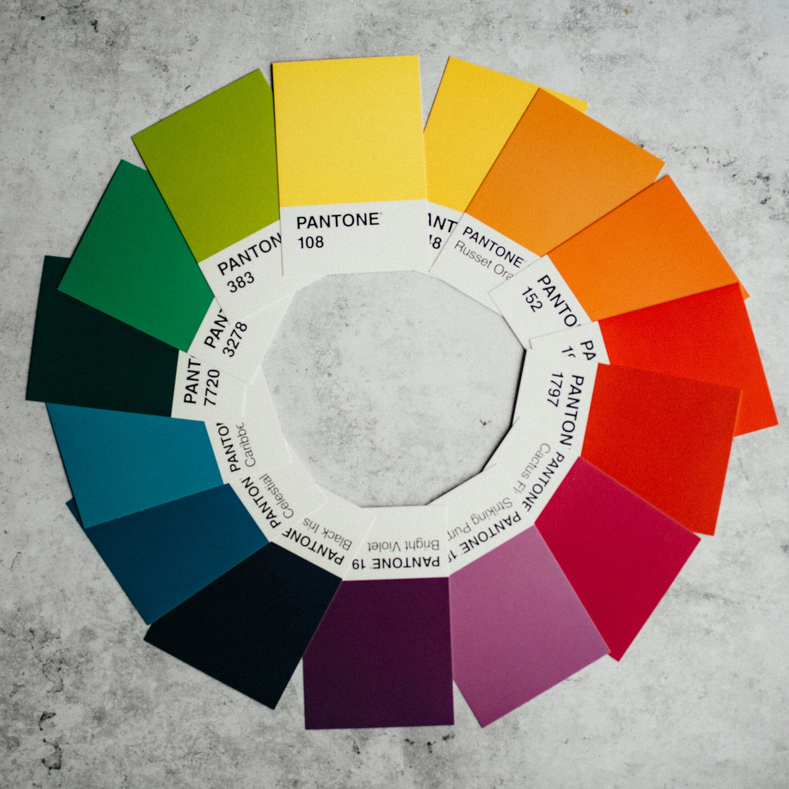
🔮 A Glimpse Into the 12 Color Seasons

Each color season is based on temperature (warm/cool), value (light/dark), and chroma (soft/clear)—and each has a unique vibe that can guide your branding.

Here’s how they translate to business energy:

🌼 Spring (Light, Clear, Warm)

Fresh, radiant, optimistic
Golden tones, corals, soft greens
Perfect for creative coaches, upbeat brands, and bubbly energy

🌊 Summer (Cool, Soft, Light)

Dreamy, refined, serene
Powder blue, lavender, muted rose
Ideal for wellness brands, therapists, holistic stylists

🍂 Autumn (Deep, Warm, Earthy)

Grounded, soulful, richly textured
Olive, rust, camel, espresso brown
Great for intentional businesses, nature-based brands, educators

❄️ Winter (Cool, Bold, High-Contrast)

Sleek, powerful, striking
Black, white, icy blue, jewel tones
Perfect for bold personal brands, luxury creatives, visionaries


🎯 Why It Works: Brand Energy Meets Visual Harmony

When your inner energy and your external aesthetic are in sync, you become a magnet for aligned opportunities.

Clients feel when you’re confident in your brand. They sense when something’s been deeply considered. And that’s what builds trust—fast.

And let’s be honest: how much time have you wasted tweaking colors that still don’t feel right?
Your palette isn’t something you should fight with.
It should feel like home.


🎨 How to Use Your Season to Shape Your Brand

  1. Start with a personal color analysis (yes, you!)
    Your brand should extend from the founder’s presence. If you show up on camera, in your brand shoots, or even on your About page—your colors should support you, not fight you.
  2. Build a palette around your season
    Pull 3–5 hues from your seasonal palette: a base, an accent, a pop, and a neutral.
    Example: A Cool Summer might use dusty rose, pewter gray, and muted navy for a grounded, ethereal brand vibe.
  3. Apply it to everything
    Website, Instagram, packaging, templates, client decks—your color choices should create recognition and resonance.
  4. Let your palette tell your story
    A rich Autumn palette says grounded. A Clear Winter palette says bold and fearless. Use these visual cues to speak before words ever do.

🧠 This Is More Than Color Theory—This Is Strategy

Color analysis for website branding isn’t about “looking nice.” It’s about building a visual identity that:

  • Reflects the heart and soul of your brand
  • Supports the founder’s personal image and confidence
  • Enhances recognition and connection
  • Translates across all touchpoints beautifully and effortlessly

In other words?
A strong color palette helps your business feel iconic, not just functional.


Final Thought: Build a Brand That Feels Like You

Your visuals shouldn’t feel like a costume—they should feel like a second skin.
Finding your color season is the first step toward showing up with more authority, more clarity, and more magnetism.

So whether you’re a vibrant Spring, a cool-toned Winter, or a grounded Autumn—you deserve a brand that reflects your essence and amplifies your voice.


💡 Ready to Find Your Color Season?

We offer done-for-you color analysis for website branding using the 12-season method, brand strategy, and visual psychology—so you can show up in your power online and off.✨ Ready to stop second-guessing your palette and start showing up like the visionary you are?
Let’s find your signature. →

Comments +

Leave a Reply

Your email address will not be published. Required fields are marked *

A vibrant red fabric element, perfect for adding a touch of color and visual appeal to your website or marketing materials. Explore the impactful use of color in aesthetic design. #redaesthetic #visualmarketing #brandcolors

Imagine opening your closet and seeing a curated collection of pieces that not only flatter you but also communicate your personal brand with confidence and clarity. For women founders, mastering your seasonal color palette isn’t just about looking good—it’s about extending your credibility and creating a consistent, authentic image that carries through your business, life, and online presence.

Shopping smarter by sticking to your palette is a powerful way to save time, reduce decision fatigue, and invest in pieces that truly serve your style and brand goals. Here’s how to harness your personal color analysis to elevate your wardrobe—and your personal brand.


Why Shopping by Your Color Season Matters for Women Founders

As a woman entrepreneur, your personal brand is your visual handshake—it’s the first impression clients and partners have of you, whether on video calls, at meetings, or in-person events. When your wardrobe aligns with your color season, you radiate confidence, professionalism, and authenticity.

Shopping with your palette in mind means fewer regrets, fewer impulse buys, and a wardrobe that mixes and matches effortlessly. This approach isn’t just stylish; it’s strategic, helping you present your best self with every outfit.


Step 1: Know Your Palette Inside and Out

Before you hit the stores or scroll through online shops, have your color swatches handy. Whether you’re a rich Autumn, a cool Winter, a soft Summer, or a bright Spring, knowing your signature shades allows you to quickly spot pieces that will enhance your natural tones.

Consider printing your palette or saving it on your phone for quick reference—this simple tool helps you avoid distractions and focus on colors that work for you.


Step 2: Build Your Capsule Wardrobe Foundation

Start with neutral staples in your palette—think blazers, trousers, and tops that form the backbone of your professional look. When these foundational pieces complement your skin tone and personal brand, you’ll feel polished and put-together every day.

Adding in a few statement pieces or accessories in your accent colors can then elevate your look without overwhelming your style.


Step 3: Use Color Swatches for Smart Shopping

Whether you’re shopping in-store or online, keep your color swatches for shopping close by. Many brands offer swatch cards or fabric samples—don’t hesitate to request these. If shopping online, zoom in on product photos and compare the hues with your palette.

By trusting your palette, you avoid buying trendy colors that don’t serve you, saving money and preventing clutter.


Step 4: Mix, Match, and Extend Your Brand Identity

When your wardrobe stays true to your palette, mixing and matching becomes second nature. This means you’ll always have outfits ready for client meetings, networking events, or content creation—without the stress of “what to wear.”

This cohesion not only simplifies your daily routine but reinforces your personal brand colors—making you instantly recognizable and memorable.


Step 5: Trust the Process and Allow Flexibility

While your palette is your guide, style is personal. If you find a piece slightly outside your season that you love, learn how to gently “break the rules” by pairing it with colors and textures that keep your overall look cohesive.

Your color palette isn’t a limitation—it’s a tool that empowers you to make choices with intention and confidence.


Final Thoughts: Shop With Purpose, Build With Power

For women founders, shopping by your color season is an investment in your personal brand’s credibility and style longevity. When your wardrobe reflects your best colors, you don’t just look good—you project a powerful, authentic image that resonates in business and life.

Ready to shop smarter and elevate your brand through color? Start by discovering your season, gathering your swatches, and committing to a wardrobe that truly supports the confident, visionary woman you are.


Would you love personalized help with your color palette and building a wardrobe that enhances your personal brand? Let’s create a style strategy that’s as unique and empowered as you are.

A stylish accessory – gold earrings with a red accent – that contributes to a strong overall aesthetic. Consider how impactful visuals like this can enhance website design. #websitevisuals #aestheticdesign #jewelryinspiration

When it comes to building a personal brand that commands attention and respect, color is your secret weapon. For women founders and style-conscious individuals, understanding your seasonal color palette isn’t just a style exercise—it’s a powerful way to enhance your presence, boost confidence, and extend credibility across your business and personal life.

To help you visualize the magic of seasonal color analysis, we’re spotlighting well-known celebrities who embody each of the 12 seasons beautifully. These examples show how aligning with your best hues creates an effortless, authentic glow—exactly what every woman entrepreneur needs to cultivate a magnetic personal brand.


Why Celebrity Color Analysis Matters for Women Founders

Think about the iconic looks you admire on screen or in magazines. Celebrities who wear colors that complement their natural features always stand out. This isn’t by chance—stylists use color analysis to craft those signature looks that feel timeless and true to each personality.

As a woman founder, applying this insight elevates your visual brand, making you appear more polished, confident, and trustworthy. When your colors match your natural tones, you project authenticity—a cornerstone of meaningful client relationships and lasting business success.


Meet the Seasons Through Celebrities

1. Winter – Cool, Bold, and High Contrast

Celebrity Examples: Lucy Liu, Sandra Bullock, Anne Hathaway
Winter palettes thrive on clear, icy hues and jewel tones. Think crisp blacks, deep navy, vibrant reds, and pure whites. Winter personalities exude strength and sophistication, perfect for founders who want to command attention with authority and elegance.

2. Summer – Soft, Cool, and Muted

Celebrity Examples: Taylor Swift, Cate Blanchett, Emma Stone
Summers glow in dusty pastels, soft blues, muted pinks, and lavender. This palette feels gentle yet refined—ideal for women leaders who want to project calm confidence and approachable professionalism.

3. Autumn – Warm, Rich, and Earthy

Celebrity Examples: Emma Watson, Julia Roberts, Jennifer Lopez
Autumn hues are all about warmth—think burnt oranges, olive greens, mustard yellows, and deep browns. These colors evoke grounded strength and creativity, making them perfect for entrepreneurs who want their personal brand to feel warm, inviting, and authentic.

4. Spring – Bright, Warm, and Fresh

Celebrity Examples: Reese Witherspoon, Beyoncé, Kate Hudson
Springs shine in clear, bright colors like coral, turquoise, peach, and warm greens. This palette bursts with energy and optimism, reflecting leaders who inspire and uplift with vibrant personal brands.


How to Use These Examples to Build Your Personal Brand

Seeing celebrities embody their color seasons can help you:

  • Identify your best shades to bring out your natural beauty and confidence.
  • Create a signature look that aligns with your business values and personality.
  • Make wardrobe and branding choices that feel cohesive, authentic, and memorable.

When you wear your perfect colors, you don’t just look good—you communicate trustworthiness and professionalism. This alignment extends to your business branding, creating a seamless personal-to-professional image that clients can connect with instantly.


Final Thoughts: Your Color Season as a Credibility Booster

Incorporating color analysis into your personal branding strategy is an elegant and effective way to enhance your presence. Like the celebrities who perfectly wear their palettes, you can leverage your best colors to boost your confidence and credibility as a founder.

Ready to discover your season and start building your brand with intention? Embrace the power of color—it’s more than aesthetics; it’s your personal brand’s most authentic glow.


Would you like help identifying your color season and creating a personal brand palette that radiates confidence and credibility? Let’s chat!

The moment of choosing an outfit from a visually appealing and well-organized clothing rack. This image highlights a mindful approach to personal style. #outfitinspiration #aestheticwardrobe #personalstyle

When building a powerful personal brand, especially as a woman founder, every detail counts — including the colors you wear. Your seasonal color analysis isn’t just about embracing your best shades; it’s also about recognizing which colors can unintentionally undermine your natural radiance and, ultimately, the credibility you project.

Wearing unflattering colors can wash you out, create a tired or dull appearance, and distract from the confident, authentic brand you want to present. Understanding what not to wear is just as important as knowing your signature palette — it’s a personal enhancement that boosts your authority, presence, and trustworthiness in all areas of your life.


Why Avoiding the Wrong Colors Matters for Women Founders

Your visual presence is a silent ambassador for your business. When your colors align with your natural features, you appear more vibrant, approachable, and credible — key qualities for building client trust and creating a cohesive brand.

Conversely, wearing colors that clash with your season can send mixed signals, diminish your energy, and make your overall brand feel inconsistent or less polished. For women entrepreneurs, who are often juggling multiple roles and impressions, this alignment is essential.


Common Color Mistakes by Season — What to Avoid

Here’s a gentle guide to the colors that typically don’t flatter each season and why:

1. Winter:
Avoid overly warm, muted, or pastel shades like peach, orange, or beige that dull your clear, cool undertones. Instead, opt for crisp, jewel tones and icy hues that amplify your natural contrast.

2. Summer:
Steer clear of harsh, vibrant colors such as bright orange or strong black. These overpower your soft, cool undertones. Soft pastels, dusty hues, and muted shades will highlight your natural elegance.

3. Autumn:
Say no to icy blues, neon tones, or cool grays that conflict with your warm, rich coloring. Embrace earthy, warm shades like olive, mustard, and burnt orange that echo your natural glow.

4. Spring:
Avoid deep, dark colors or cool blues that weigh you down. Your warm, light palette shines in clear, bright, and fresh colors like coral, peach, and light turquoise.


How to Gently Break the Rules Without Losing Your Edge

Fashion is personal, and rules are meant to be adapted—not ignored! Here’s how to incorporate “off-season” colors thoughtfully:

  • Use accessories: Incorporate less flattering colors in scarves, bags, or jewelry to balance your overall look without overwhelming your natural palette.
  • Layer strategically: Pair a “risky” color with a dominant piece in your seasonal palette to soften its impact.
  • Experiment with prints and patterns: Prints can blend colors in a way that feels harmonious even if individual shades aren’t perfect for your season.
  • Trust your intuition: If a color makes you feel confident and radiant, find ways to wear it in small doses or with flattering makeup to support it.

Final Thoughts: Elevate Your Credibility Through Color Awareness

For women founders, mastering the art of wearing your right colors—and understanding which to avoid—is a form of self-respect and strategic branding. It’s not just about looking good; it’s about feeling your most confident, authentic self so your personal brand can shine with integrity and impact.

By refining your wardrobe choices with seasonal color analysis, you build a visual presence that supports every interaction, presentation, and connection — creating a seamless extension of your leadership and business ethos.


Ready to take your color confidence to the next level? Let’s explore your palette and find the perfect balance between honoring your season and expressing your unique style.


Would you like me to help you identify your color season or review your current wardrobe for alignment?

read the recent posts

DOWNLOAD HERE

Need help building an aesthetic brand? Well don't worry friend because this guide will help.

The Aesthetic Business Empire Starter Kit

Get your free guide

Want first access to exclusive information, trend alerts and the latest news from The Aesthetic Edit?

Unlock the Aesthetic Insider 

JOIN THE AESTHETIC  COMMUNITY!JOIN THE AESTHETIC COMMUNITY!